
We’re in this odd chapter of nesting. Not in the traditional sense, I’m not pregnant and expecting.
But we are in a season of transforming our home for foster children, and that’s something that’s really exciting.
I’m no Joanna Gaines by any means, but I love to take all a room offers and transform it into a livable space.
In comes my current home office/gym, the “middle room,” as we call it.
Among being my home office/gym, the room was my baby sister’s home base during her three years with us and then a guest bedroom. It’s windowless and, honestly, the perfect spot in the house for a nap because of it.

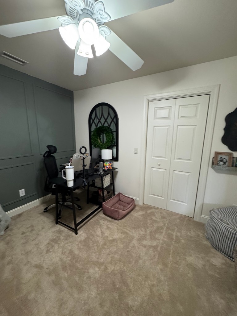

Though I’ve already started shifting the space around to fit our foster kids, I thought it’d be a fun opportunity to share my process of taking the room from its current state to its new one: the kids’ room.
GAH. What a phrase to use!!!!
Step one to the madness is laying out a visual design, or mood board of sorts, for what I want the room to look like. I’m a planner and a visual learner, so this is a vital step for me as I start to design the space.
Using Adobe Express, I saved images of the pieces we’re buying and deleted the backgrounds of the furniture, carpet, and decor that will be the foundation for the room. I then laid the concepts out on two working scenarios.
Here’s what we know for sure: Gabe and I are being licensed to foster single children or sibling pairs from newborn to eight years old, meaning we need a flexible space to meet various ages and needs.
Let’s walk through each one.
Room Version #1
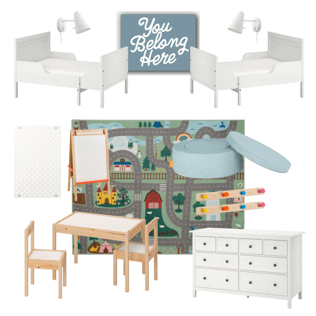
When it comes to an aesthetically balanced room, I love the layout this first scenario provides. With the extendable beds situation along the back wall, the space feels like a proper children’s room with enough carpet space left to house the easel, table, and play ottoman (the Nugget Chunk, in case you’re curious).
But here’s the issue. With two extendable beds, we’re limiting ourselves to the older ages of our range. And we need to be more flexible with our space for a potential crib placement.
Room Version #2
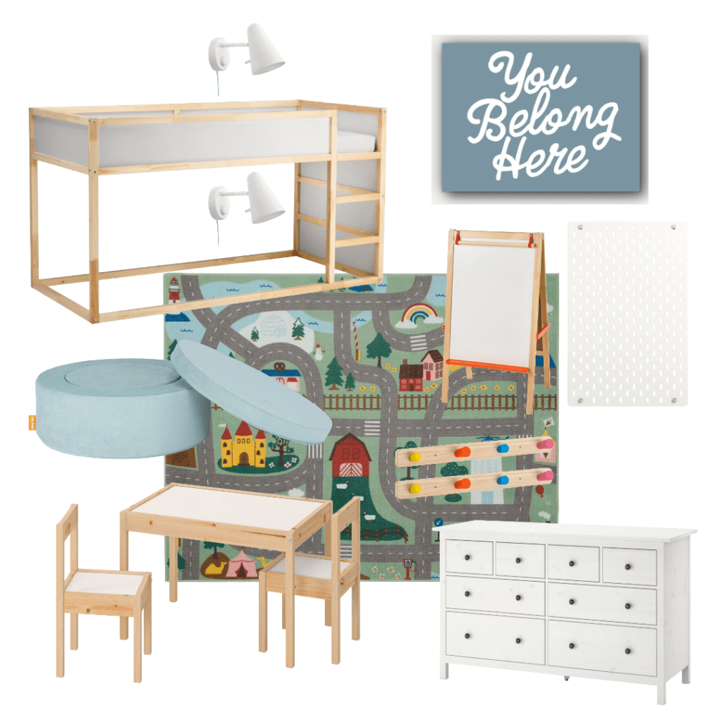
I love this layout, and it’s currently my top pick for our kids’ room layout. This reversible bed from IKEA gives us the opportunity to get wildly creative by adding a second mattress on the floor (on top of a box spring) and create a true two-bed scenario that takes up less space WHILE allowing us to keep the room in a single child scenario if we only have one in the house.
Not to mention, this opens up the space for a crib on the right side of the room if needed at some point.
While I’m thinking about it, why not just show you guys the visual process of adding in a crib to the layout?
And in case you’re curious, the You Belong Here sign? I designed that! It’s currently in process of being made into a 30″ x 40″ canvas to take up the wall where the TV is currently at.
I’m so excited to get this transformation started and especially to share the process along the way with you all.
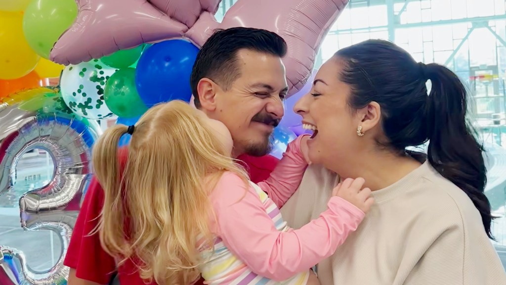
In the meantime, can I ask you to also join us in praying for the children who will be sleeping in this room? We want each one to know they’re not only in a safe spot, but that they’re deeply loved.
Until next week,


Leave a comment